Katy
Chen
Graphic Design | Illustration | UI/UX | Social Media | Brand Development
UI, UX, and the Nitty Gritty
With the goal to produce a minimum of three page of our company website, I initiated a two-week sprint with 2 teammates with UI, UX backgrounds and a SCRUM master, we set to create a mockup on Figma.

Our initial research revolved around the company and their people. We wanted to know what they expect and want to see on the website. We explained that an expectation could be the essentials and the want are more of what are some bonus information that would be nice to see.
Next, we looked at companies in similar industries and others that we felt embody the look and feel the company aims to portray.
From there, we drew mockups in the style of "Crazy 8s" where we draw create 8 lo-fi sketches in a limited time.


Circling back to the company, we created a new color scheme that aligns with the identity that the company wants to evolve into.
Many weeks and iterations later, we proudly present our fully functional mockup that is being implemented onto the new company website.

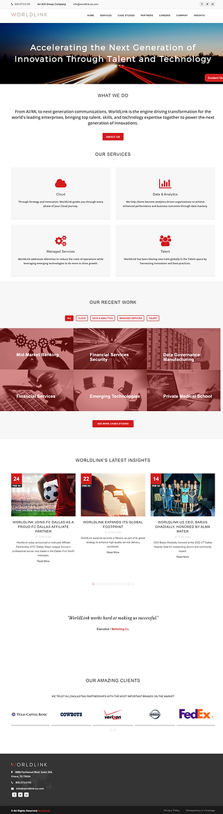
Original Home Page
New Home Page
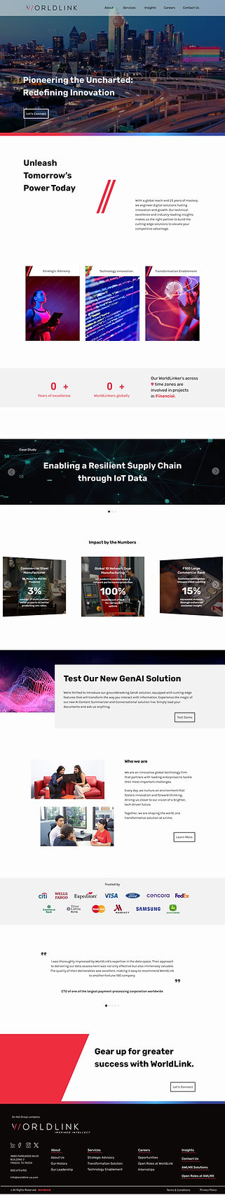
Nav bar that disappears when scrolling down, reappears when scrolling up
B-roll video on the main pages for dynamicity
Bold statement and CTA
A quick blurb about the company with animation using their iconic slashes
Organized services into
3 main buckets
Implementing their slashes in the title as slants
Overview with stats
Featured news rotating
Featured stats and overview of projects serviced
Newest and latest
Snipped of About Us
List of clients on rotation
Client testimonials for insight on working with the company
CTA on every page
Footer with quick navigation to essential sites and pages
About
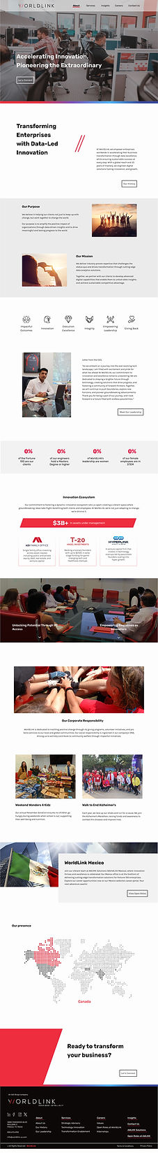
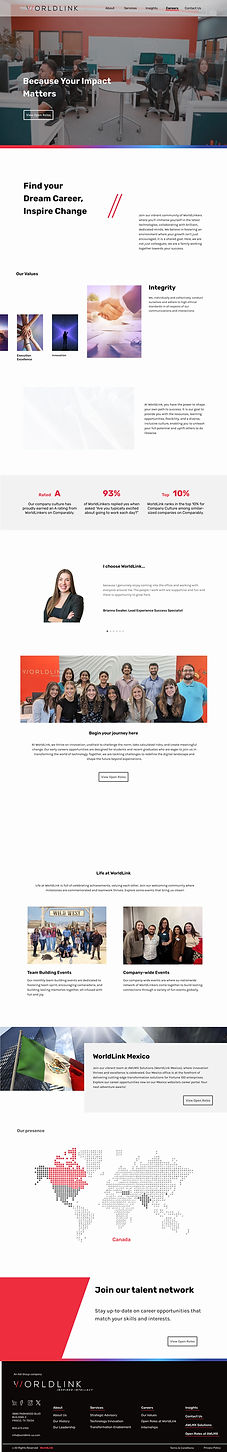
Careers
Leadership

Case Study
